Solutions / Brands
Keep the product page beautiful while making buying cues readable.
Show design, development, and stakeholders the exact product-page detail to improve without flattening the brand.
 Fixed sample / comparison context
Northstar artifact preview
One product page URL becomes proof your team can act on.
A real product page turns into visual proof, a developer-ready row, and a read-only delivery room when the handoff is prepared.
- Problem found
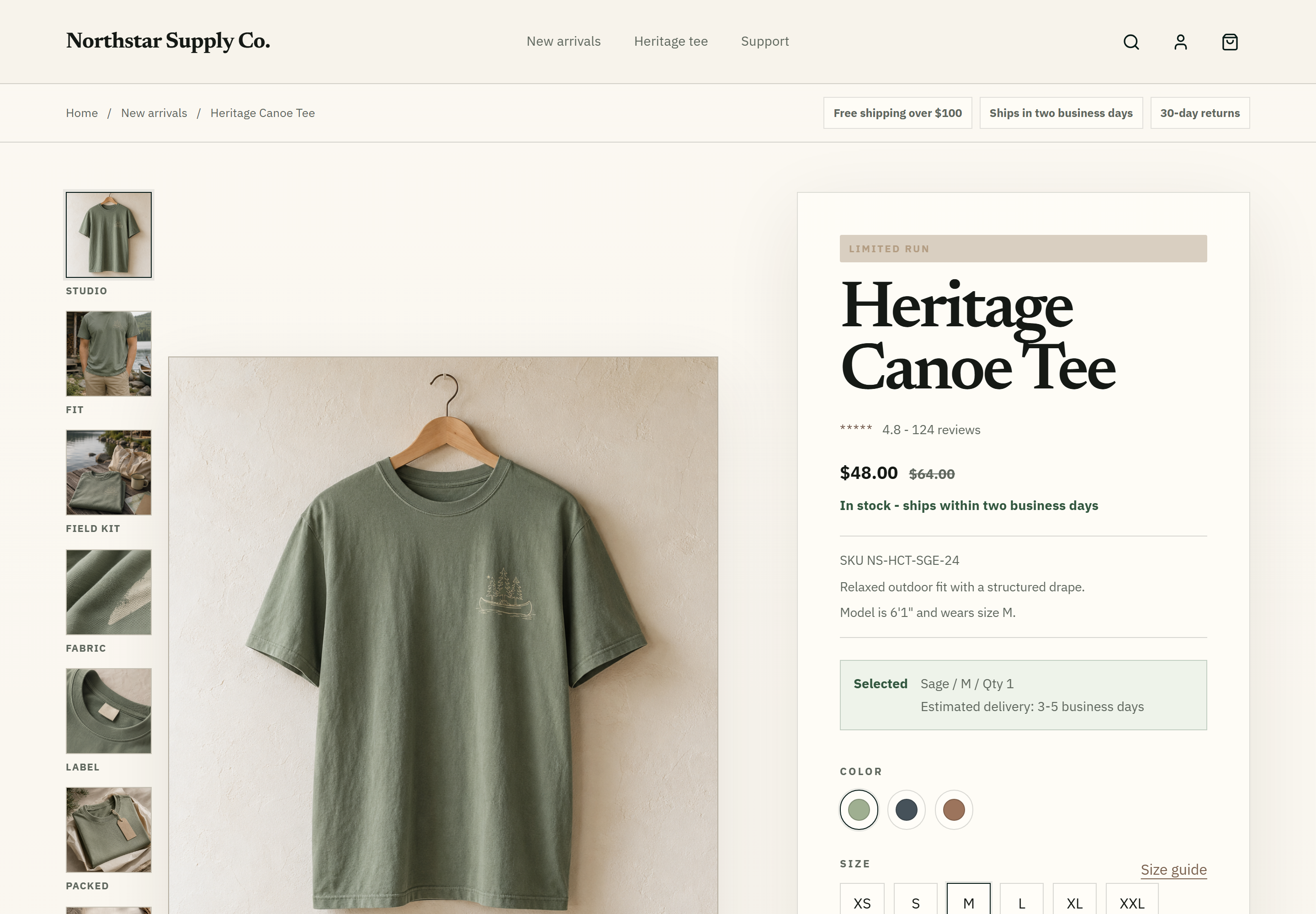
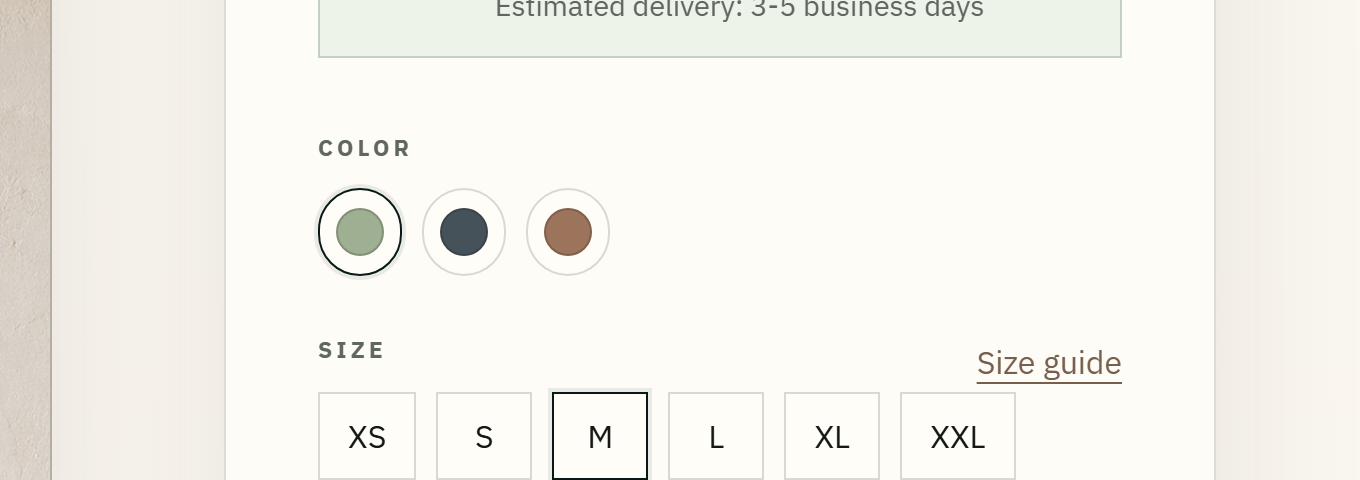
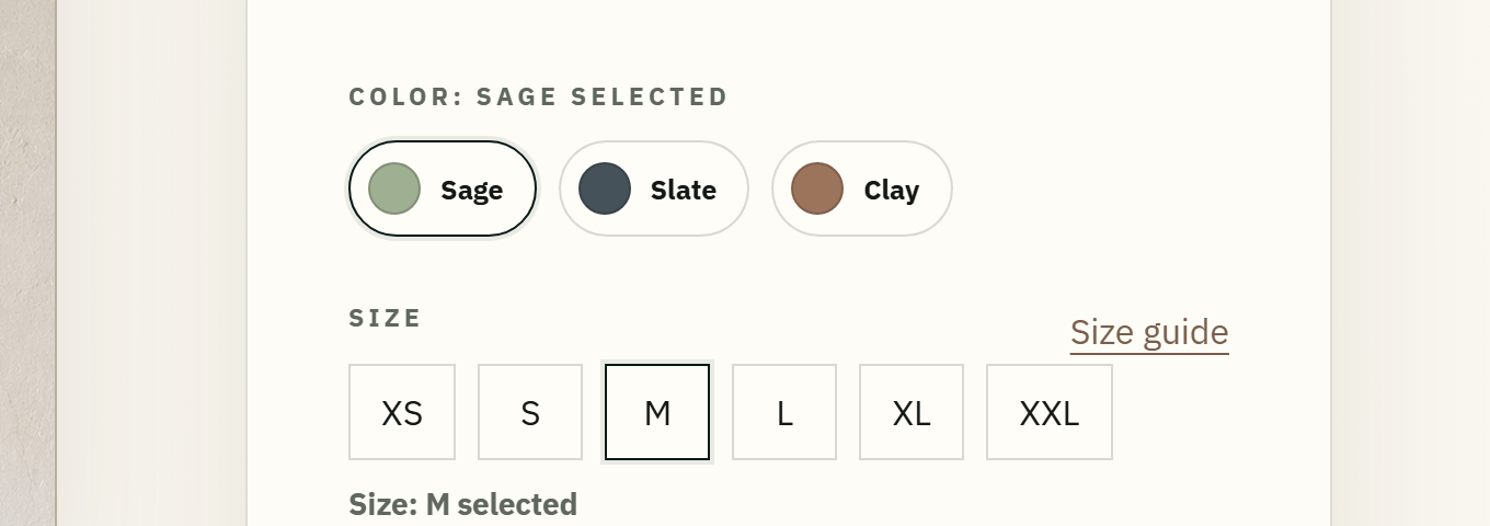
- Choose a product size before adding the item to cart.
- Suggested change
- Expose selected state on size options and keep selected-size feedback near the group.
- Ready for your developer
- Size option group
Finding set from one URL
Brand artifact preview
A fix your brand team can approve.
The room is written for the people who need to review the page, not for a backend process.
Brand tone preserved
The fixed sample keeps the subdued Northstar product tone while improving readability.Design-system-ready change
The suggested fix can move into badge color tokens instead of one-off page edits.Stakeholder approval room
Visual proof, fix row, and receipt status sit in a customer-readable delivery room.Ready to try one product page?
Before
Badge hard to read
Suggested fix
Stronger contrast, brand tone preserved
Fixed sample
Readable buying cue
Fixed sample / comparison context
Brand team scenario
The issue is not a badge. It is a buying cue shoppers need to read.
Shopping confidence
A finding is explained in the context of status cue, promo badge, size, color, price, shipping, and add-to-cart decisions.
Developer planning
The fix row gives the team page, element, suggested change, evidence, and recheck path.
Brand preservation
The fixed sample shows how readability improves without flattening the product tone.
Stakeholder review
The delivery room gives non-technical teammates one readable place to review the handoff.
Brand use case
From merchandising question to reviewable handoff.
01
Merchandising or design lead submits a PDP
The first page is a real product detail page, not a generic site sample.
02
Issue is located in buy box context
The finding is explained around promo/status, price, size, color, shipping, and add-to-cart decisions.
03
Developer receives a fix row
The row names page, element, suggested change, evidence reference, and recheck path.
04
Stakeholders review the room
Files, visual proof, receipt, and follow-up URL request stay in one customer-readable place.
05
Fixed sample preserves brand tone
The comparison shows stronger readability without flattening the product page style.
Shopping tasks we review
We look where shoppers need clarity.
Brand-muted UI often becomes unreadable exactly where shoppers need clarity.
Read promo/status
We return a finding note plus a contrast-preserving suggested fix.
Choose a color
We return label and selected-state guidance when swatches are unclear.
Compare price
We return a fix row when sale, compare-at, or savings text loses priority.
Save for later
We return accessible-name and focus-state guidance for save controls.
Check shipping/returns
We return a customer-readable note tied to the buy box task.
Submit follow-up form
We return label and error-state guidance with a recheck path.
Why this is different
Customers see the outcome before the process.
Shoppers can read buying cues
We explain the affected buying moment before we show the fix row.
Developers know exactly what to change
The action row includes page, element, suggested change, evidence, and recheck path.
Brand/design can approve the fix
The fixed sample shows readability improving without flattening the product tone.
Client team can review without chasing files
The delivery room keeps evidence, receipt, and follow-up URL requests together.
Visual proof
Screenshot context and element evidence tied to the affected product page.
Fix row
A developer-ready row with owner, page, element, suggested change, and recheck path.
Delivery room
A read-only client space for files, evidence, receipt, and follow-up URL requests.
Fixed sample
A public sample comparison showing the intended direction without changing your site.
Next step
Start with one product page your brand team already reviews.
Send a public product page URL and see whether the page can become visual proof, a developer-ready row, and a reviewable delivery room.